This paper describes innovative and replicable techniques used by the team on the Disaster Risk Assessment of Uttarakhand in India to overcome technical challenges when compiling data on the exposure and vulnerability of buildings and people (specifically tourists). We hope readers find the narrative from overseas interesting but it’s also possible that the techniques described here could be replicated in New Zealand and across the Pacific to fill data gaps and support risk and impact assessments.
1.1 Uttarakhand
Uttarakhand is highly susceptible to natural hazards, including earthquakes, fluvial floods, flash floods, and landslides. It is situated in Northern India, bordered by Nepal and China (Tibet), and several large and active seismic fault lines bisect the state. Heavy rainfall and steep terrain in the hilly areas exacerbate flash flooding risks, and landslides are very frequent occurrences, thereby threatening lives and requiring costly regular repairs to infrastructure. In many ways, the terrain is not unlike parts of New Zealand, although it is far more densely populated, with over 10 million inhabitants in one state.
Exposure in the state is highly dynamic in space and time, and Uttarakhand’s population is growing rapidly. It is industrializing and urbanizing at a rapid rate, with urban areas drawing an increasing number of people from the more remote and hilly rural areas. Over time, these trends continue to increase the exposure of urban communities to hazards, particularly flooding and earthquakes
1.2 Composition of risk and the disaster risk management cycle
In catastrophe hazard modelling, risk is defined as the product of 1) hazard likelihood and severity, 2) exposure (both economic and human), and 3) the vulnerability of infrastructure and the human population. Adaptive capacity is a sub-component of vulnerability and represents the ability of the community, asset, or entity to adapt to the impacts of a hazard and thus reduce its inherent vulnerability in future. Effective disaster risk management is a defining characteristic of resilient societies, and a resilient community is able to manage and limit exposure to threats, minimize its vulnerability, and adapt reasonably well. Impacts of hazards on communities, economies, and systems are both direct and indirect, and probabilistic risk assessment aims to understand these impacts and identify which factors contribute most to the overall risk for a given location, type of asset, community or source of revenue.
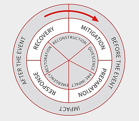
A useful cyclical framework for Disaster Risk Management is illustrated in Figure-1. This is, in theory, a virtuous and fully integrated cycle, where improvements in each phase of the cycle should increase resilience in communities over time, and risk assessment and analysis are components of mitigation in the cycle. Effective mitigation defines actionable mid to long term responses and interventions to minimize the risk posed by uncertain future events.
Figure-1. A schematic representation of the Disaster Risk Management Cycle (from Alexander, D.E., Principles of Emergency Planning and Management, Oxford University Press Inc, USA, 2002)
2 The Disaster Risk Assessment of Uttarakhand
Hazards themselves are very difficult or, in the case of earthquakes, presently impossible to prevent from occurring or to mitigate or control directly. In Uttarakhand, the priority of the World Bank-funded “Disaster Risk Assessment of Uttarakhand” project was to reduce risk and build resilience by focusing on reduction of exposure and vulnerability, whilst exploring how to build adaptive capacity.
There is a very high dependency on primary and secondary data for the hazard modelling and for the development of the exposure and vulnerability data sets, and risk assessments often stimulate innovation in data acquisition. The approach adopted was to leverage trusted secondary sources of data as much as possible, but that presented a huge challenge in itself as most available data lacked either completeness or coverage. This article presents examples of two techniques that were used during the study to build adequate building exposure datasets (with appropriate detail and state-wide coverage), and to understand the spatial and temporal distribution of tourists.
3 Innovative Approaches to Scaling-Up Exposure Data
Two specific technical challenges that the project faced were 1) to ensure sufficient coverage of building-level information and b) to understand the movement (spatial and temporal) of tourists across the state.
3.1 Predictive analysis of building typologies and vulnerabilities across the state
The predominant building types in a settlement (town or village) heavily influence its risk profile. For this reason, it was essential to identify the various building typologies found around the state and then map their distribution in as much detail as possible.
Based on preliminary field surveys and consultation with local experts, we confirmed fifteen (15) typologies or structural classes as being sufficiently representative of the state’s structural diversity. Vulnerability curves were developed for each typology in order to estimate the expected damage resulting from the different levels of hazard intensity, measured in Peak Ground Acceleration (PGA) for earthquakes and water depths and velocities for flooding.
The remaining and formidable challenge was to map the distribution of each typology across the entire state and to do this rapidly and with sufficient accuracy. This was not possible using field surveys alone given the short timeframe, and attempts to map each typology individually using remotely-sensed imagery failed, due primarily to the lack of a correlation between typology and roof material (or any other building property visible from space) as well as the prohibitively high cost of high-resolution imagery.
Instead, the project team built a web-based collaborative and “crowd-sourcing” application, whereby trained volunteers quickly traced and demarcated built-up areas and isolated building clusters manually, using a backdrop of lower-resolution yet appropriate and freely available satellite imagery. Within five weeks, building clusters in over 73,000 tiles were digitized successfully. Systematic quality assurance measures ensured the reliability of this impressively detailed dataset of built areas and building clusters across the whole state.
The team then developed random forest regression models (a machine learning algorithm consisting of decision tree ensembles) to predict the relative proportion of building types in any given building cluster. The model was trained and validated using 23,000 individual building surveys from 425 towns/villages across all 13 districts in the state, selected to ensure coverage of the full diversity of the state’s buildings (in urban and rural areas, hills and plains, accessible and remote).
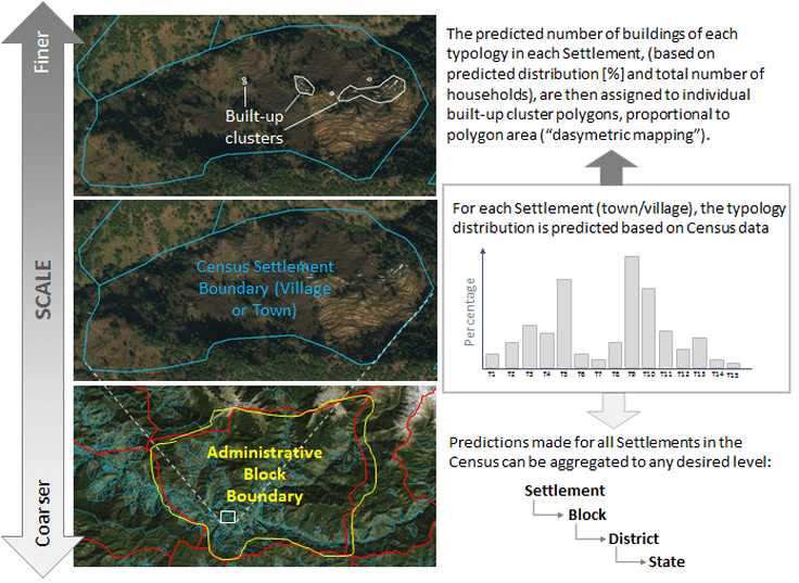
Inputs to the model consisted primarily of aggregated responses to the most recent Census (quantitative and qualitative), supplemented by remotely-sensed datasets related to economic activity (such as night-time light levels). Predictions made for each of these Census aggregation units (i.e. the expected distribution of building typologies in that “block”) were then dasymetrically mapped to the building cluster polygons digitized within that block (proportionate to their area), generating high-resolution maps of building distribution across the entire state.
In a relatively short period of time, that approach enabled the project team to produce a detailed map of Uttarakhand’s structural diversity; an essential component for the state-wide risk assessment. Figure-2 illustrates an example of the final output and how the information could be aggregated up from building cluster to different scales.
Figure-2. Results of the predictive model for building typology distribution and exposure.
3.2 Web crawling to expand understanding of tourist exposure
Official statistics exist giving the number of total annual visitors for major tourism destinations, but that data provided no information about the spatial and temporal distribution of tourists over the course of a year or where they may cluster. Additionally, Uttarakhand lacks a geospatial inventory of hostels, hotels, and guesthouses.
The approach to overcome these limitations quickly was to mine the wealth of information freely available online, focusing on booking/review websites (such as TripAdvisor and Booking.com) and anonymized metadata from social media sites hosting photos (Flickr). These data sources have inaccuracies, but they have proven to have usable and valuable metadata, good scale and coverage in 2017 (that coverage is growing), and they have proven sufficiently reliable for defining aggregated zones or “hotspots” of tourism activity in spatial and temporal terms. The data of these zones were corroborated by other sources and through stakeholder consultation.
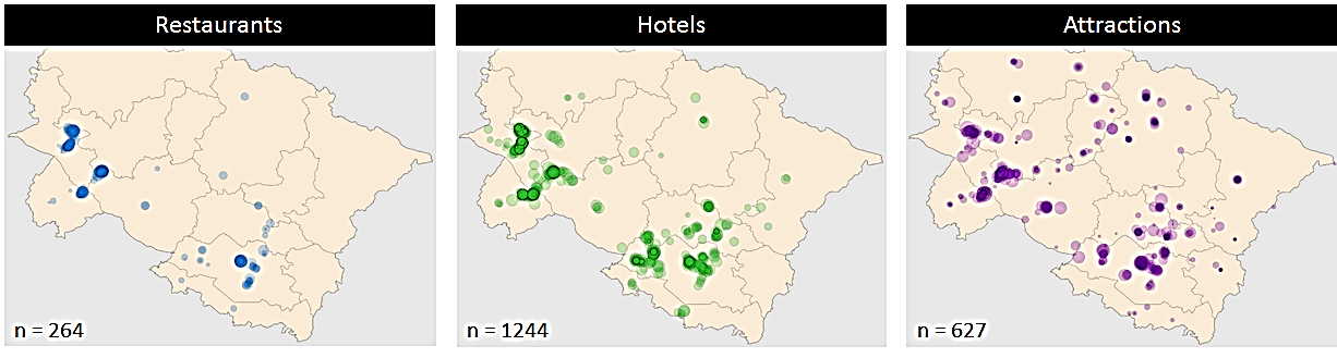
From geotagged and public photos hosted on Flickr, selected metadata were extracted: location coordinates (and precision), date, time, and categorization of the establishment or site. For all attractions found on booking/review websites (points of interest, hotels or restaurants), we extracted location coordinates as well as the number of reviews (as a rough indication of popularity) and a qualitative measure of how expensive that site was (relative to other options in the state). The team processed the data to remove duplicates and ignore outliers for location, but most inaccuracies were tolerable given that the intention was to derive ‘activity zones’ (based on kernel density functions) rather than precise points for specific establishments.
Figure-3: Example of cluster for establishments extracted from Trip Advisor. Marker size is proportional to the number of reviews, an indicator of popularity.
An increasing number of photographs are posted to social media sites on a daily basis, and many of these photographs have embedded metadata showing exactly where and when the photo was taken. For tourist exposure assessments, these can be a valuable resource, so long as care is taken to ensure privacy is respected and data are aggregated before use. While most social media platforms now strip out this metadata information by default, others retain it or leave it up to the person uploading the photograph to decide. An example of the latter type is Flickr, where users have uploaded almost 55,000 geotagged photographs taken in different parts of Uttarakhand, providing a fascinating insight into the attractions and events frequented in recent years.
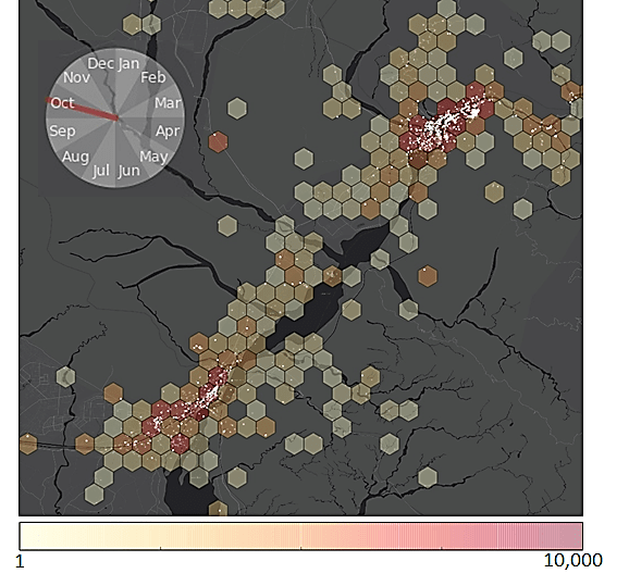
As an example, Figure-4 shows all geotagged photographs taken in the month of October, in and around the towns of Haridwar and Rishikesh, which are significant sites of Hindu pilgrimage. Individual photograph locations are shown as white points, while the hexagonal bin heatmap indicates relative concentrations of tourism activity in the area.
As is the case for information extracted from booking/review websites, the quality of metadata for photographs was variable and there were some limitations. For example, they did not necessarily correspond to tourist activity, as local people who want to share an interesting aspect of their own town or village would also take photos. Additionally, the useful data was limited to those individuals with access to a GPS-enabled device such as a smartphone, meaning only a subset of the entire tourist population was represented. The data also only indicated locations deemed “photo-worthy”, rather than representing a full log of everywhere that tourists might spend their time while travelling around the state.
Despite these limitations, these datasets have both provided useful information on likely tourist distributions that would otherwise be difficult or impossible to estimate (such as tea-shops along mountain highways, perched over precipitous drops to take advantage of the views, as highlighted by dense clusters of photo points). By using relative densities of hotels, photographs, etc. rather than absolute numbers, it was possible to define and differentiate tourism activity zones with a reasonable degree of confidence.
Figure-4: Geotagged photographs (white spots) as a proxy of tourism spatial and temporal clustering in the urban areas of Rishikesh and Haridwar in October. Hexagon colour represents density of photographs and the scale is logarithmic.
4 Linkages to urban resilience
This paper has outlined two simple approaches that illustrate leveraging the power of social media and online content aggregators to scale up coverage and supplement existing data on infrastructure and visitor exposure in urban and rural locations. The data gave a better understanding of the spatial and temporal variabilities across the state, and that allowed the team to define better structural and non-structural interventions to reduce risk and build resilience.
Rapid digitization and increased connectivity provide opportunities to exploit social networks, big data, and machine learning throughout the Disaster Risk Management Cycle (Figure-1). However, it was observed that decision-makers presently lack capacity and understanding to exploit these opportunities fully or plan to avert any emergent threats. However, it is recognized that Uttarakhand’s socioeconomic standing is such that it has the potential to leverage new technologies and become a digital leader in the risk management domain.
DHI Water & Environment (DHI) is a global non-profit consulting and research organisation that has been in operation for over 55 years and has approximately 1200 staff operating out of over 25 offices globally. DHI recently delivered the Disaster Risk Assessment of Uttarakhand in India for the World Bank Group and is also delivering a programme in Bhutan to strengthen national disaster risk assessment and management systems.